If a potential customer, donor, or stakeholder can’t read or use your website, you don’t just have a compliance failure or technical failure; you have a communications failure.
Accessibility is often treated as an unnecessary compliance burden, like a privacy policy lawyers worry about but no one else thinks about.
Until there’s a breach. (For the record, I think privacy is also important, but I’ll save that for another post.)
Your brand might be a problem
Good communications is about reaching the right people, with the right message, in the right way.
If your audience can’t read or use your content, you’re not communicating in the right way.
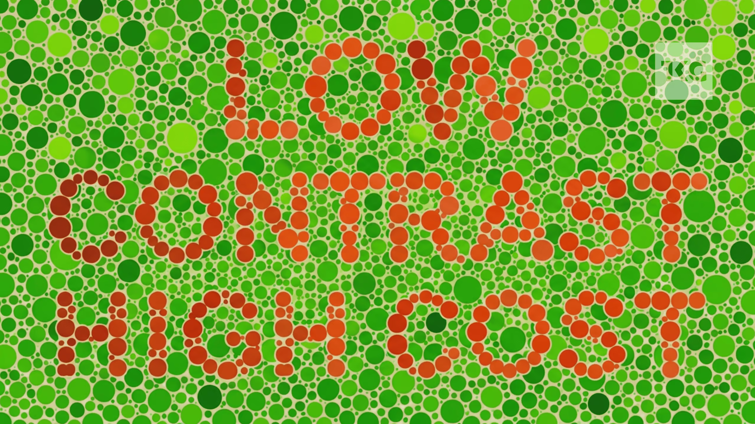
The most common failure isn’t an obscure technical one: it’s low contrast text. Things like light text on a light background, dark text on a dark background, or low contrast text overlaid on an image.
Shockingly, 84% of the top million websites have low contrast text, according to this year’s WebAIM Million accessibility audit. That’s a brand palette or website design, sponsored or signed off by a comms function.
Second on the list is missing alternative text on images, on 53% of pages. Third is unlabelled form fields, on 51%. (These failures also make it harder for search and AI bots to read your site, losing another valuable audience.)
Low contrast affects everyone
Why do so many websites fail on accessibility basics? Perhaps part of the problem is the misperception that accessibility is about catering for an extreme minority with visual disabilities.
Accessibility isn’t only about the estimated 400,000 Australians with ‘low vision’ short of blindness. Around 1 in 12 men and 1 in 200 women have some level of colour blindness. Also, everyone starts losing contrast sensitivity from their mid-40s. And anyone of any age will have difficulty reading small or low contrast text on a mobile in bright lighting.
You don’t need to have a formal disability to find it harder to use a website that doesn’t meet accessibility standards. You just be over 50 or outdoors on a sunny day.
Don’t build a flagship store your customers can’t enter
Investing in a website build that doesn’t meet ISO-standard Web Content Accessibility Guidelines is like investing in a flagship store in a location many of your customers can’t access.
If that isn’t enough, accessibility is also critical for good SEO, as search engines like Google are less likely to trust sites with poor accessibility. (So fewer people will find your flagship store in the first place.)
The good news: there’s an easy fix
There are many free online tools for testing accessibility, and the fix might be as simple as changing the colours in your site’s stylesheet.
I recently ran my own consulting website through a free tool and found that the subtle colours I used for lists and eyebrows above headings were too low contrast. A quick look at my website on my mobile in daylight confirmed it actually mattered, and I fixed it in 5 minutes by updating the stylesheet to use a lighter colour.
Do you need help reviewing or improving your website’s accessibility? Let’s meet up for coffee and discuss.